Maintenance App
A tool for managing repairs and work orders in residential properties.
My Role
Lead UX/UI Designer & Researcher
The Challenge
Technicians rely on SMS Assist to manage work orders and fix issues in residents’ homes, but the old app was doing more harm than good. Slow, clunky, and outdated, it left technicians frustrated and managers scrambling to keep things on track.
In just one week, our team set out to rethink the app from the ground up, focusing on what technicians need to get their job done faster, communicate better, and feel confident in the tools they use every day.
Business Goals
We had 3 top goals for the redesign.
Redesign the app to improve usability and efficiency for technicians.
Bridge communication gaps between technicians, residents, and managers.
Align with business goals, ensuring managers retain oversight and operational control.
Discovery & research
To address frustrations and uncover opportunities, I led a one-week sprint to analyze, ideate, and prototype.
Research Highlights:
User Reviews: Word clouds from app store feedback revealed pain points like “slow” and “confusing.”
App Architecture Mapping: Documented existing workflows to pinpoint inefficiencies and technical bottlenecks.
Stakeholder Sessions: Captured business needs from technicians, managers, and internal teams to guide the redesign.

Original Design
Journey Map
With only 4 days, we had hefty goals of what we could accomplish. We began by writing out a technician journey map. This allows the team to think of opportunities within each step along with empathizing with the user.

The last bit of prep work research gathered was meeting with stakeholders. Our stakeholders consistent of different business units, with different goals and ideas for this new app. I wanted to capture their thoughts and ideas to make sure that it was kept in mind during the brainstorm.

Concept Creation
After understanding more about the technician’s journey, it was time to start concept creating. Timeboxing ourselves for 10 minutes at a time, we pushed ourselves to come up with as many sketches as possible, waiting to refine them later.
My concepts were focused on a clear way for the technician to communicate with the resident. I focused on making ‘I’m on my way’ a prominent feature. The idea was once the technician clicked that button, a notification on the residential app would be triggered.

Gathering Feedback
Before refining concepts, we met with stakeholders again to gather feedback. After walking them through each concept, they had the ability to vote for 6 different ideas. We still needed to validate these concepts with the users, however, it was essential to gather business feedback.


Iterating Sketches

We made several iterations from the original concepts we had based on some initial stakeholder feedback. We wanted to refine our concepts a little more before testing with users due to tight deadlines.
Here are some of the main iterations made:
Technicians could add work orders to their route. If a stop came up along the way, they could tap on ‘add work order’, enter basic information, and easily keep record of their work.
Users need to access a map of nearby part stores.
Based on the type of work order, we could suggest different parts the technician should ensure they have before going to the location to help reduce return trips.
Testing with users

I tested these concepts with 2 different types of users: technicians and their managers. I tested with 4 managers and 4 technicians; what I found was very interesting.
Technicians and their managers wanted very different experiences.
Managers were displeased with some of the information we were showing technicians in our concepts. For example, allowing technicians to enter in more work than assigned to them was a big issue. This was seen as overstepping how managers were running their business. They want their technicians to complete work orders in the order they assign them. However, when we showed this to technicians, they liked the experience.
Even though I’m designing an app for a specific user, I need to ensure it follows their responsibilities at work. If I fail to also meet the manager’s needs, they will not adopt our app. This became a crucial part of user testing, since eventually th goal was to allow create a configurable view for managers.
Based on feedback from both technicians and manager requirements, I worked with the UI designer to create refined high fidelity prototype.

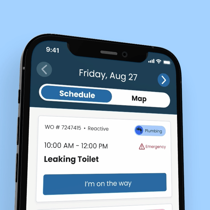
Daily Schedule
Technician’s need a way to view their daily schedule. Most technicians do not know their daily route until the night before (at the earliest). In some cases, technicians will get assigned their daily schedule one work order at a time. Therefore, there was little use for a calendar view. Since we needed to accomodate for a variety of manager styles, we did provide a way for some technicians to view future work orders, however, they really will only be looking 1-2 days ahead.
Technicians need the ability to switch between a list and map view of their schedule. Depending on their activity, they need this flexibility. The map view allows them to get a high level of the area they’re heading to, where their route is most likely concentrated in. The orange dots on the map showcase nearby part stores for the technicians to easily identify on the way to their next location.

Celebratory Feedback
When I tested with technicians, one of the main pieces of feedback was around this feeling of accomplishment for when they complete jobs. When I dug in deeper technicians mentioned how one of their favorite features on the current app was the green check marks they get when they complete a job.
This was more of an emotional need - which led me thinking how to continue providing this sense of accomplishment.
When technicians completed any steps or a job, they were shown green check marks. We also designed a fun experience for when a technician completes all of their work orders for that day, to help them celebrate a hard days work.

Step-by-step requirements
When I talked to managers, they mentioned that one of their biggest pain points was their technicians clicking the wrong button at the wrong time. Non tech savvy technicians get confused on the current app with all these buttons.
For each work order, technicians are provided with a list of requirements. This list can be scalable if more requirements get added on over time. Even though the user can see future steps, they only have one activated main CTA. This helps us provide expectations up front to technicians to keep them focused.

In-app navigation
One of the business’ biggest pain points was the technician opening the app, looking at their next work order, closing the app and heading to the location without clicking the ‘I’m on my way’ button. Without clicking that button, there is no way for us to notify a resident when the technician is on the way and their ETA. How could we keep the technician using our app?
Technicians need in-app navigation. Working closely with the developer on the team, we were able to talk through pros and cons of this potential solution. He was able to help lead the team through different API discoveries based on user experience requirements.
The buttons on the bottom sprung from inspiration I got using Spotify on carplay. When a user is driving, bigger buttons are needed and only basic functions/features need to be available. When talking to technicians about their experience driving from location to location, the main three actions they take is contacting the client, finding nearby part stores, or calling SMS Assist. These buttons along the bottom provide shortcuts to the users.
“The app transformed how I work. It’s faster, easier to navigate, and finally feels like it’s built for us, not against us.”

Outcomes
Technician Wins:
Improved Morale: Green check marks and animations reinforced a sense of accomplishment.
Simplified Tools: Intuitive design minimized errors and maximized job focus.
Business Outcomes:
Increased Efficiency: Reduced task time through clear workflows and navigation.
Enhanced Communication: Notifications kept residents informed, reducing complaints.
Decreased Return Trips: Suggested part stops helped technicians complete jobs on the first visit.
Reflections
This project highlighted the importance of balancing user and business needs. By designing an app that empowers technicians while supporting managers' workflows, we created a solution that is scalable, intuitive, and user-centric.