


Context
OrthoFi’s Treatment Coordinators needed a faster, more accurate way to configure treatment plans for in-network patients, particularly when applying carrier-specific logic to itemized procedures. This took place live during patient consultations, where coordinators had just minutes to select treatment details as the doctor relayed them.
Our goal was to embed an intelligent recommendation engine (iMaxX) into the Treatment Details Page, enabling real-time code suggestions based on carrier rules and treatment plan data - all without disrupting workflow. This not only improved usability, but helped practices maximize production by reducing in-network discounts through smarter code configurations.
My Role
I led end-to-end UX design from discovery through launch, collaborating cross-functionally with engineering, product, and clinical operations to ensure feasibility, adoption, and measurable outcomes. I also worked closely with SMEs to define logic requirements and align design with both clinical and business goals.
Challenge
The feature had to:
Seamlessly integrate into a high-traffic, time-sensitive workflow
Work within the constraints of an existing design system
Support logic-based code recommendations (via InRule)
Be transparent and easy to override to build trust with users
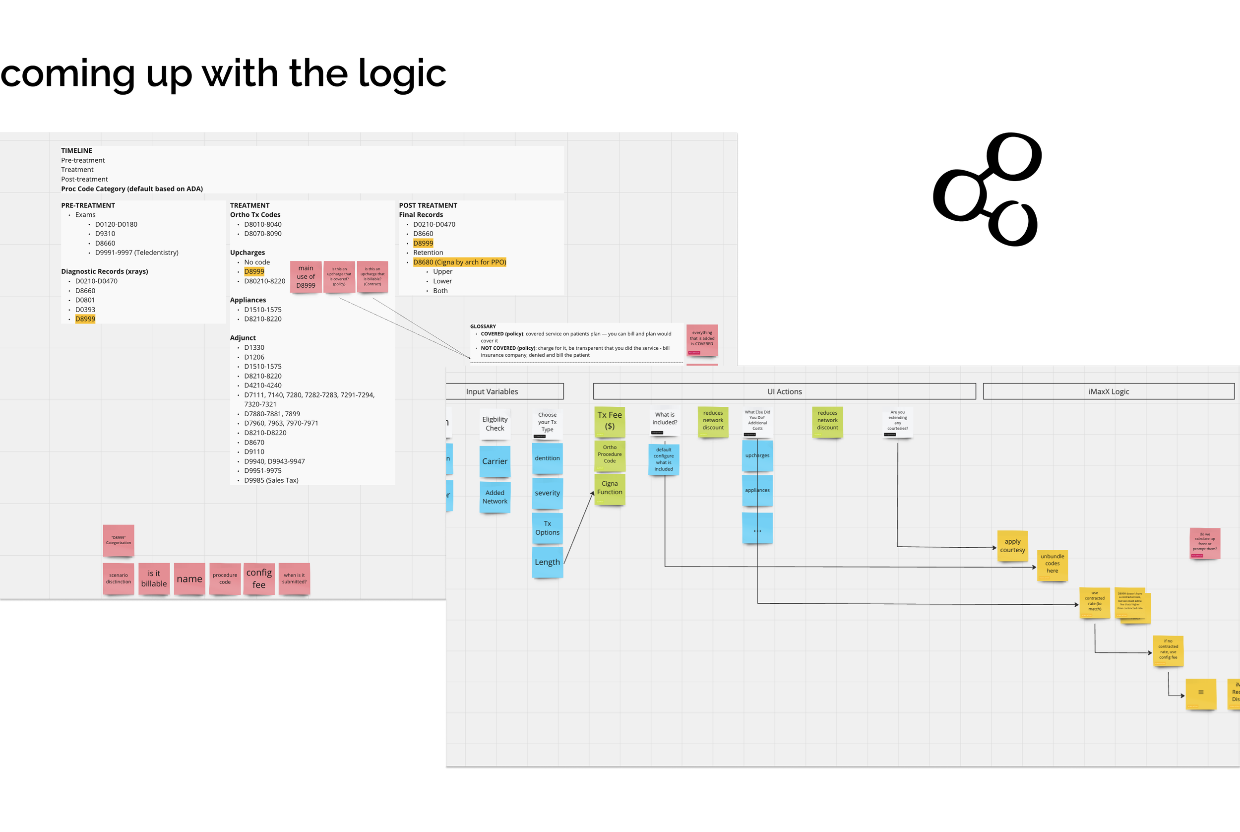
Creating the Internal System Behind iMaxX Logic
The internal configuration team, led by Paula, was responsible for managing procedure codes, carrier rules, and practice agreements — the backbone of how iMaxX delivered accurate, logic-driven suggestions. However, the legacy system was outdated, manual, and error-prone, leading to inefficiencies and high risk of configuration errors.
Challenges:
Managing multiple procedure codes and carrier rules was inconsistent and time-consuming
The system lacked scalability, forcing manual workarounds that jeopardized data accuracy
My Approach:
Deep Collaboration: I led ongoing sessions with Paula and insurance expert Tina Byrne to map workflows and surface critical inefficiencies in the existing tool.
Iterative Refinement: To reduce change fatigue, I reused visual patterns from the previous UI while introducing scalable functionality — including advanced filtering and reusable rule templates to minimize repetitive setup.
Scalable Design: I designed a system that could scale with growing carrier complexity, ensuring long-term flexibility as new agreements and rule types were added.


Crafting the Treatment Coordinator Experience
For Treatment Coordinators, speed and clarity were everything. During patient consultations, they had just minutes to configure treatment plans and select recommended procedures, all within the Treatment Details Page, a high-traffic, high-pressure workflow.
Iteration 1: Informational Banners
The initial design used dual sections with prominent informational banners intended to guide decision-making.
💡 Insight: Usability testing revealed that TCs consistently ignored the banners, focusing only on titles and checkboxes. The banners added noise rather than clarity.

Treatment Details Page: Dual Banners
Iteration 2: Enhancing Trust Through Visual Refinement
To reduce visual noise and reinforce trust, I removed the informational banners and updated the section titles to incorporate the iMaxX logo. This added credibility to the recommendations while maintaining focus on the key interaction points: checkboxes and codes.
Result:
Users immediately recognized the iMaxX name and associated it with reliability. This small visual shift helped clarify purpose and reduced scanning time during fast-paced consultations.

Treatment Details Page: Descriptive Titles and iMaxX Logos next to titles
Iteration 3: Streamlining Focus and Editability
I introduced expandable cards with checkboxes to reduce visual clutter and allow Treatment Coordinators to focus on one section at a time. This helped minimize overwhelm and improved the scanability of key selections.
Feedback:
TC’s appreciated seeing their selections persist on the main page, allowing for quick edits and faster confirmation during live consultations.

Alpha, Beta Launch & User Feedback
Alpha Testing & Iteration
As part of our early design validation, I created a feedback deck to capture key observations from alpha testing. This round revealed critical UX issues, including unclear hierarchy and navigation friction, which, shaped our subsequent iterations. These insights helped ensure our decisions were both data-driven and user-centered from the start.
Beta Launch & Real-World Validation
Following improvements from alpha, we launched a beta version in live environments. Treatment Coordinators praised the intuitive checkbox interface for its clarity and responsiveness. Both the configuration and care teams reported increased efficiency, with faster task completion and smoother workflows.
Result:
Minor adjustments post-launch confirmed that our design changes directly addressed user pain points — validating our iterative, research-led approach.

Final Design & Business Impact
MaxX transformed complex insurance workflows into a streamlined, user-friendly experience that delivered measurable business outcomes. By redesigning navigation with intuitive tabbed menus, expandable task cards, and smart filters, I reduced cognitive load and improved task completion speed by 25%, while increasing feature adoption by 40%. Real-time selection previews and subtle branding enhancements also built trust and improved usability across teams.
Note: Due to legacy code constraints, some visual elements were unchanged. The design focus was on optimizing workflows and delivering impact, prioritizing business outcomes over surface-level UI polish.
This project shows how thoughtful UX can drive results in complex SaaS environments — improving both user satisfaction and the bottom line.
iMaxX currently launched on app, Jan. 2025
Key Results
Efficiency Gains:
Internal team setup time decreased by 29%
TCs consistently met tight consultation timeframes with greater confidence and fewer clicks
User Adoption & Impact:
Checkbox-based interface significantly improved usability and adoption.
Referencing Tina Byrne in UI copy reinforced clinical credibility and user trust
Lessons Learned
Collaboration Builds Resilience: Partnering with SMEs like Tina Byrne ensured our logic framework was both clinically accurate and scalable.
Iteration Drives Alignment: Testing and feedback loops helped align business goals with real user needs.
Simplicity Wins: Small changes like collapsible sections and smart defaults that can dramatically impact speed and satisfaction.
Next Steps
With iMaxX launched in January 2025, the focus shifts to:
Scaling the tool to all practices for broader adoption and operational consistency
Expanding use cases for the logic engine beyond treatment configuration
Continuing user feedback cycles to drive future enhancements